March 25,2018 Hey people.. youre not going to believe it! I pulled through.. YEP, ME, I DID IT! I FINISHED MY COVER PAGE!!! Ahh this sweet moment I cant even believe its real.... Here is the link to my cover page: https://www.canva.com/design/DACzCu0i5zU/share?role=EDITOR&token=DYX5gyjRmd0wGL1bqhxcnA&utm_content=DACzCu0i5zU&utm_campaign=designshare&utm_medium=link&utm_source=sharebutton My plans did change alot. At first I had thought of doing a bubbly font. When i started putting the magazine together it didnt go, it made it seem like a joke and this was defintely something I wanted adults thinking was serious. Then I had also had the idea that I told you guys about (The white font) because it makes it look more "professional."I realized that so many things can change due to literally just one picture. You guys can see I added a little pop of color here and there but not TOO much so the model can be focused on. I decided to also go with th...
Posts
Pictures with colors means everything!
March 24,2018 Hey guys, today I am definately feeling more motivated and have alot more concrete ideas going through my head. My phone was distracting me a bit so I had to shut it off. Ok so speaking of fonts and colors, I wanted my magazine to be about fitness but at the same time give a nature vibe to the whole picture. This is the reason I chose to do it outside. The green in the background with the blue sky and clouds, allowed me to use darker color fonts in order to contrast with the picture. It took me a while to play around with the took and I accidently removed so many things multiple times. Then I decided to go with a yellow outline for the cover to contrast the color in the main picture... Thats all I have so far so ill keep you guys up to speed. xoxo, Valeria
Any little thing is progress
March 22, 2018 Hey everyone!! Ive been a busy bee lately... Im juggling so much in my life with grades,school, and almost everything! Well guess what everyone... Drum roll please.... I started the cover of my magazine!!!! I know, I know, very exciting. Im so proud of myself because spring break started this week and school is almost over but I am working hard and getting everything done. I honestly cant say its easy and I wish I could be closer to being finished but im glad I started it. Since my mind has been everywhere, my ideas for my magazine have been as well. I promise to keep you guys updated with any further progress but honestly for me, once i start it, it continues to flow. I feel like personally what I struggle with is getting the first idea out. That is why for my magazine cover I was really conflicted with the color scheme and what pose I should have my model use. I still cant decide between the one where she is looking straight into the camera about to run...
Ashley to the rescue
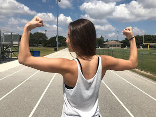
March 18, 2018 And... HERE IT IS!!! Finally it all worked out and I was able to go to the track and field at my school with Ashley. She wore a spaghetti strap like I asked her and she really brought her photogenic A-Game today! She rocked these pictures. Here, take a look. Now, this one is a great demonstration of her arms and it focuses most on her body and also provides a great blue- sky background. In this picture Ashley's face looks a little bit awkward so I do not think I can really use it. This one was very good also because it shows Ahsley making her way towards me as if she is ready to embark her fitness journey with my magazine. I do not think I will use this one even though her arm looks EXTREMELY FIT because the background of the bleachers really ruins the picture itself. This one is another picture similar to the third although the background is also the bleachers and it focuses more on the background than Ashley and her body hers...
Failures make you grow!
March 16, 2018 On this fine Friday afternoon, I will be discussing my character and everything I went through. Today I was planning on having the final images taken of my friend Ashley but she became very ill and no other one of my friends volunteered to actually be involved as being the character for my project. I thought it was important to blog bout this because in projects, there are also failures and misleads and that is exactly what has happened today. Something else I decided Is not having the images taken at the gym rather at the track and field at my school because I love the background picture it would provide for my magazine. For the next time, when I have the pictures taken of my friends Ashley, I told her to wear a spaghetti strap shirt in order to show her arm muscle. As of now, I hope you all stay tuned for my next blog because it will be an interesting one. Toodles!!
Fonts

March 15, 2018 Hi!!!! In today's episode of my blog, I will be speaking about the certain fonts I want on my magazine cover. I will ONLY be discussing the fonts I will be using on my cover, not the two page spread. I want to take it step-by-step and also because I don't plan on using the same fonts are use for the cover and for the two page magazine spread. As I previously stated, the website I will be utilizing order to create my magazine layout is Canva. Because I chose to do this, I'm working with the font sizes they already provide. I had never worked with Canva before although I am very positively surprised by everything they have to offer. I have two different fonts I was very intrigued in. both of these fonts I believe I will be able to explain why I selected them and how they reflect my fitness account. This font is great because it reflects my "bubbly" personality and that is the exact vibe I want to give off in my magazine and to my au...
What not to do.. or do?
March 11, 2018 Welcome back to my favorite audience! Today's blog will be an ironic one. I say this because while I was conducting more research and specific headings I should use for my magazine, I came across an article specifically revealing lies and fake information magazines use in order to capture their audiences attention. I guess you can see where I'm going with this… Yes, I used this articles examples as to what not to use to use for the headings and subheading for my magazines. Hey, if it evidently worked for the other magazines, it can most definitely work for me! This article not only cleared the doubts I had on what I should right for my headers, it reinforces that sometimes exaggeration is the only way to capture the audiences attention. Phrases like "5 moved for rock-hard abs" are exact keywords I need to use to capture that attention. Here are ideas I brainstormed for my headings and subheadings: -Using a celebrity as an example -Betterin...
Informative Night
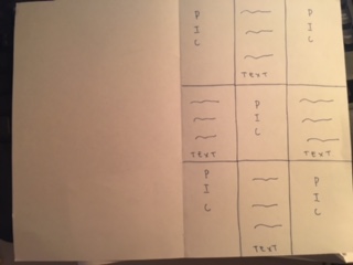
March 9, 2018 Good night everyone , on this wonderful night I will be showing you guys my sketch of one of the two page spreads of my magazine layout. I took the example I had post about last time and included that in my sketch. As you can see, I created a checkered pattern where it will alternate from picture to text. In doing so, I will be able to explain the pictures I included in a short sweet sentence. Within the next week I will have taken at least two pictures at the gym with different exercise poses to then determine which one I like the best to include in my cover image. Cassidy, the girl I wanted to utilize as my protagonist, is not sure she will be able to participate due to how busy she is so I've had to shift characters. Hence, I will either be using my friend Ashley and I, or just Ashley, or just myself. I like the idea of incorporating two characters into one cover page to show unity and to how our magazine offers a friendly approach. I also created a sc...
The Layout

March 7, 2018 And we're back! In today's episode of Valaria's blog, I will be discussing how I want my magazine layout to look like. I searched up a couple of examples as to what I want the final outcome to be and this is what I came across: What I loved about this magazine two spread layout, was how it was in a checkered pattern where it was pictures next to phrases that are not too long where it loses the audience attention and not too short where it does not give enough information. I also love the incorporation of the blue color scheme into the magazine which creates a soothing tone and attention grabbing aspect to the magazine. What I also found interesting is how the entire spread uses the contrast of black vs. white in specific areas to not make the spread too light or too dark. This is definitely a concept I want to use when making my spread. Bibliography: How to Design a Custom Header with the Them...
Plan x10

March 8, 2018 Planning time! Hello readers! I stated in my last blog that I was going to have a more clear idea as to how I was going to design my layout and my cover page as well... I decided that I will be asking my friend Cassidy who is a "gym addict" and is constantly going to the gym and actually even has her own fitness account on Instagram. I feel like she is the perfect fit due to her experience in the fitness world. I also thought maybe she would do a specific gym pose, which conveys her fit body and will demonstrate the purpose of my magazine. I also decided that there will be multiple fonts and colors all throughout the cover page to emphasis the sections with a bigger font. That will represent something more important the magazine has to offer. The magazine bellow is also an example as to how I would want my model to look like. Bibliography: Top Ten Fitness Magazines . www.allyoucanread.com/top-10-fitness-magazines/.
Fitness
March 7, 2018 Fitness here I come! Hello there! As I already mentioned, I plan on creating a fitness magazine. Because I chose to do this, I conducted a profound amount of research which allowed me to conclude the following: they usually emphasize on health and beauty, exercise, and nutrition. They also incorporate many tutorials or incentives to promote that magazine. After analyzing all of this information I decided that I need to create a cover page that will generate an astounding amount of attention. This will not only be visually appealing to the eye of the reader, but will be a form of promotion and will attract a greater amount of costumers. All in all, I want a magazine that has bold colors such as red to create that "pop" sense to my magazine. Although I'm still confused as to who I want the protagonist of my cover image to me! I'm not sure if I want to utilize myself or someone else. After all this research I was only able to determine...
Face the challenge
Sunday, March 4,2018 Hey everyone! My name is Valeria Luna and I am excited to lead you into this adventure... The day has finally come, my first blog post! I have a million thoughts going through my head trying to decide which topic to choose. Personally, I have many interests, and I feel like one topic isn't enough to elaborate on. This year has gone by so fast.. I remember studying my notes on angles shots and composition for other projects, and the day has finally come to do our Portfolio! I never thought creating a magazine would be as difficult as it is. The reason I decided to do a magazine was because I felt like I could turn a topic I love into something so much more interesting so other people can get a sense of what I feel about it. Using words, pictures, and other tools, you can make a topic that is not so interesting to some, much more interesting. As the thoughts fluttered in my head, the first topic that came to my mind was food. Everyone eat...